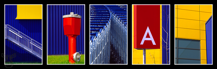
If you read some of my comments for other Pictures of the Month, you know my fondness for strong and bright colours. Here another picture of the "saturation warning" kind.
Who doesn't know IKEA - the Swedish company with their furniture stores spread all over the world. Well, we know it (actually my wife Barbara better than me, which I heard is just normal within married couples - the female part always FINDS something in IKEA, even if she seldomly NEEDS anything ...). And we quite often visit it, not just because we are Sweden fans).
Not enough going there during opening hours - I used a "free" sunny Sunday in April this year and packed my camera (the EOS3), a lens (70-200/2,8 L USM) and some rolls of colour saturated films (Kodak EBX 100 "Extra Colour"). For some hours I prowled around the IKEA parking lot, looking for any interesting subject - and there are more any normal visitor might habe observed. The brand logo itself is perfect - blue background and yellow text - I love contrasting colours even more than just saturated ones.
More time it took later on to scan (Minolta Dimage Scan Elite 5400) and mount some of the pictures to the panorma I present today. Each of the pictures would have been a nice one for itself, but the combination - a potpourri of several impressions from a lonesome area, which usually is crowded by thousands of cars every day, was the goal and appealed even more.
Completely analogue this picture would have been complicated.
On some of the pictures disturbing elements were eliminated with the computer,
e.g. contact points for lightning conductors or the embossed text on the hydrant
including some scratches in the metal cap). A hybrid world - analogue
photography and digital finishing. I think a good way still not too archaic.
Of course it's not reality due to it's manipulation, but I think it's easy excusable if stated and also it's not nature ...
Have fun with the hybrid and experimental world, |